Design Secrets: Speaking in Code
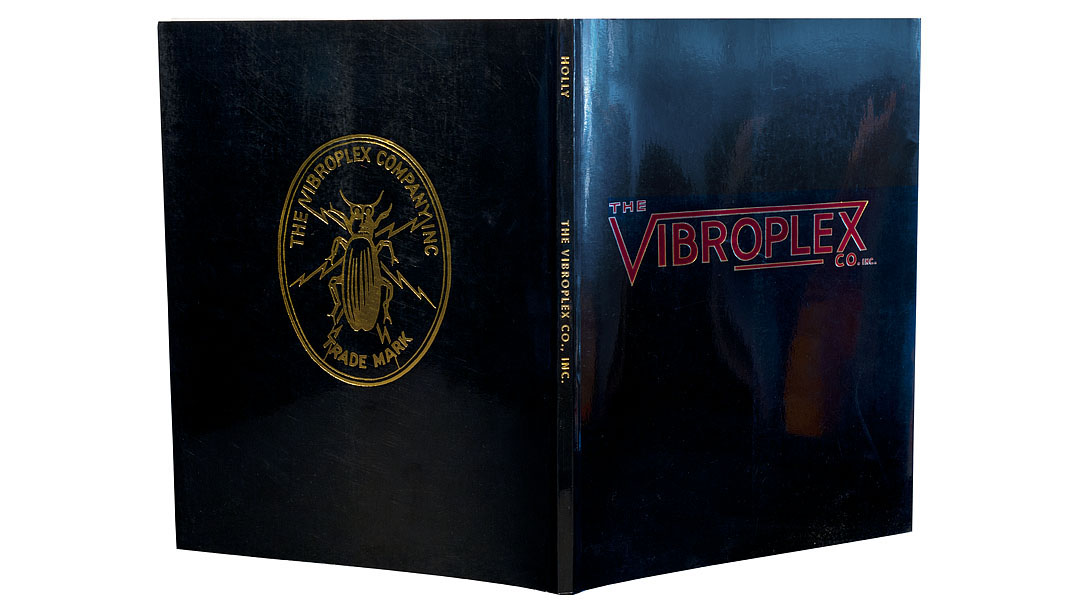
The Vibroplex is a hand-operated telegraph key that’s been in continuous use for more than a century. It has an enduring place in the history of telegraphy and has been called the “Rolls-Royce of keys.”
The unique feature of this key is that it makes Morse-code “dots” automatically, on its own; the operator still has to make “dashes” but since the key generates all dots without human intervention, this dramatically reduces the amount of stress that keying produces on the operator’s arm. (Back when telegraphy was one of the main systems of communication, most telegraphers suffered terribly from what was called “glass arm” in their day, and what we now call carpal tunnel syndrome.) The Vibroplex is also famed for its top-notch construction and reliability.
When I designed the book that recounts the history of the Vibroplex, I knew that virtually all buyers and readers would be active telegraphers, so I set the running heads at the tops of the pages in Morse code.


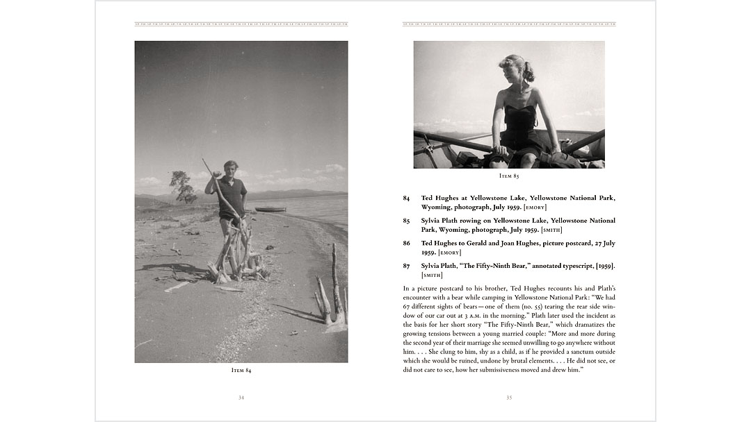
While working on the design of the catalogue and case labels for a major Plath-Hughes exhibition at the Grolier Club in New York City, I saw ample evidence of this constant and complex intertwining of the poets’ lives, and decided to make a tessellated design that could represent it.

This SP•TH•SP•TH motif on the border of the title pages appeared throughout the book and exhibition. The Stinehour Press printed the catalogue in black and gray ink on uncoated Mohawk Superfine paper, which not only afforded us the chance to reproduce photos as duotones (for increased dynamic range and visual impact), it also enabled me to set the SP•TH design in the quieter voice of the gray ink.
During the preliminary design, I researched which printing types the two poets had used in their books. Once I learned that each of them had used Bembo in at least one title, there was little question as to the type that would be most appropriate for this catalogue.


You're Behind the Scenes at Bruce Kennett Studio
phone (+1) 603-387-3725 bruce@brucekennett.com
© 2018 Bruce Kennett Studio
CONNECT